Tuesday, 31 December 2013

NEW YEAR IN CAPE TOWN IS CARNIVAL TIME!

By Erika Kruger

In Cape Town  New Year celebrations are associated with the Kaapse Klopse or Minstrels taking to the city streets in a high intensity burst of energy in their colourful outfits and variety of musical instruments. 

Later in the year the different troupes also participate in the annual Cape Town Carnival.

In 2010 Martin was assigned to documented the carnival in March and in June of the same year, he also photographed the Cape Town Street Festival held to welcome the 2010 Fifa World  Football event to the city.

Here are some of the images from those two memorable events.


Thursday, 28 November 2013

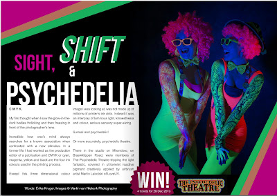
SIGHT, SHIFT & PSYCHEDELIA - Land n Sand Digital Magazine Ed 3 Nov 2013


Cover image for Land n Sand Digital Magazine Nov 2013


Images by Martin Van Niekerk and text by Erika Kruger for article on Stellenbosch-based performance art group The Psychedelic Theatre and UV artist Martin Labotski of LoveUV 


Martin Labotski of LoveUV (Image: Erika Kruger)


Studio on Blaauwklippen Road (Image: Erika Kruger)


Martin Labotski preparing Zen's body art for the shoot. (Image: Erika Kruger)

Wednesday, 20 November 2013

BIZ PORTRAIT PARTY - Professional portrait shoot with a difference

By Martin Van Niekerk


We recently participated in a really enjoyable project. In fact it didn't feel like work at all!

The Biz Portrait Party was organised by in-bound marketing expert Bettina Horvath of My Biz Performs at The Workshop Space in Main Road, Somerset West to encourage business and professional people to invest in good quality and appropriate professional portraits for social media. 

While professional make-up artist, Candice Harker, was plying her trade and I was photographing the nine dynamic and beautiful business women one at a time, Bettina lead an informal discussion and question-and-answer session on the role of images in social media.

All the while we were treated to good coffee and eats. A party indeed!

What our clients said:
Bettina Horvath in Google+: 
Last week I organised the Biz Portrait Party with +Martin van Niekerk photography - the results are outstanding! It is so worthwhile to have a professional photoshoot done for online images, wouldn't you agree when you see these pics? 


 The end result: Nine professional portraits 

 The Biz Portrait Party in full swing

Wednesday, 6 November 2013

SO, WHICH WAY WOULD YOU LIKE ME TO FACE? 5 facts about a portrait sitting your (conscious) mind was unaware of


‘So which way would you like me to face?’

A question every photographer about to shoot a professional portrait, is asked as soon as the model arrives in the studio.

The problem is that there is no simple answer to this seemingly simple question. Should the photographer:
  • Position the client according to the lighting configuration he or she has set up to achieve a particular outcome or because the location demands it?
  • Accommodate the client’s preference for a particular side? People often feel they have a good side that looks better on a photo.
  • Take into account facial features that might make the image less aesthetically pleasing e.g. turning the model’s head so that a larger eye is further away from the camera?
  • Listen to what neuro-anatomists and cognitive psychologists tell us about portraits?

What your subconscious knew but did not tell your conscious mind 

Here are 5 interesting facts about portraits that you probably don’t know. At least not your conscious mind but if you had to dig up some old photographs, you see that your subconscious had known a thing or two all along.

1. Most of the time we choose to be photographed with the left side of our face, facing the camera. Why? Not because of any cosmetic or physical attributes that we favour but because the left side of our faces show more emotion than the right and we are hard-wired to experience intense emotional responses more aesthetically pleasing. According to a study published in Experimental Brain Research the left side of the face shows more muscle movement in response to emotions. That is because the right cerebral hemisphere tends to be more involved in the perception and production of emotion than the left.1) And more emotion makes for better portraits, the theory goes.


2. The left-side bias has been known to naturalists and artists for a very long time. The theory of that which we seem to instinctively know about portraits, has been the topic of neuro-anatomy and art theory for hundreds of years. It was Darwin who first observed that the two sides of the face do not move and express emotion in the same way. His observations have since been confirmed by experimental and physiological studies. 2) For example in their study Turning the left cheek, researchers McManus and Humphrey indicate that 60 % of portraits painted since the 16th century show the left side of the sitter’s face. 3) We seem to prefer seeing and rendering a person’s more emotional side in a painted portrait. And the same goes for photographs.


3. But not always! We seem to have a different face bias for self-portraits depending on whether we are artists or non-artists. According to Bruno and Bartomini’s surveys of art books and exhibitions, show the majority of artists featuring the right side when composing a self-portrait, a phenomenon that is considered an art convention. Historically, painting or drawing a self-portrait required working of your own image reflected in a mirror. This method reverses the image you work from hence the right side bias. Nowadays artists most probably work from photographs which in the long is bound run to change the self-portrait posing conventions taught at art school. 4) This is what neuropsychologists Nicola Bruno and Marco Bertamini found when they observed people using smart phones to take ‘selfies’. Non-artists prefer the left side more often than the right even if you have to contort your body to get the shot. 5)


 4. Portrait type, social position and career choice also influence our choice of left or right facing portraits. When we are posing for a more informal family portrait when go for the more emotionally expressive left side. 2) But there are times when the sitter prefers to not show their softer, sensitive sides. It might be for reasons of status, for professional reasons or as a result of convention. Several studies have shown that natural scientists, chemists and engineers tend to show their less emotional right side ‘more in keeping with the stereotyped pose of a professional rationalist’. 3) Academics in the human sciences e.g. language and psychology departments tend to show the left side of the face probably feeling more comfortable showing their most emotional aspect to the world, unlike the engineers who want to ‘appear more rational and suggests that these hard scientists seek to display themselves to the world as the unemotional clichés of popular myth’. 3)


5. Sex may also help determine the cheek of choice - Male academics in the Churches tend to prefer showing the right cheek while female academics tend to show the left cheek more often. It is possible that the observed biases were the result of ingrained cultural and stereotypical gender roles depicting women as more emotional than men 2)
References:

Thursday, 10 October 2013

STILT WALKING & FIRE EATING

Earlier this year we met the most amazing group of people on a shoot for another client. 

The Psychedelic Theatre performance art company from Stellenbosch brainchild of performance artist and actor Lanel Van der Kolff positively sizzle with energy, colour and creativity. 

They dance and they jiggle; they dress up and they jump up; they twirl and they twist. They hula with hoops and they play with poi.

Stilt walking steampunk actors, Anton and Claire Van Der Vyver of Gordons Bay manage to perform these physical manoeuvres on 1,5 m high poles!

Take a look at these images as well as the previous blog post.


For more information about this fascinating couple, see an article on them in Sept / Oct 2013 edition of the digital magazine Land n Sand.


STEAMPUNK IN STELLENBOSCH - Land n Sand Digital Magazine Ed 3 Sept/Oct 2013


Friday, 4 October 2013

Saturday, 31 August 2013

IMAGES CAN MAKE OR BREAK A WEB PAGE: Using images to put the brake on a speedy click through


An image strategy can make
or break the usability of your web site
 
Images can make or break a web page.    
Big companies know this and small businesses know this! You will seldom come across a web page without images or graphics.

But often it is very obvious that not much thought has gone into selecting the images that must communicate the company’s message. It lacks an overall strategy that integrates not only design elements (the relationship between text and images) but also the company’s brand strategy with the design approach.

Typically the small business owner will provide the text and the designer will put together the website.

Then at some point during the process, the topic of image comes up and one of a number of actions might follow:

  • Best case scenario: A professional photographer is called in to document company products, people and installations

  • Second-best case scenario: The business supplies its own images that might or might not be substandard quality or outdated or in appropriate and the handiwork of employees on site or whoever is in charge of marketing.

  • Worst case scenario: The designer opts to purchase stock images to illustrate the website.

  • Ultimate worst case scenario: The designer illegally downloads images of the Internet.

 I can already hear you say that this is all conjecture and that it shows my bias towards employing professional photographers like us. 

And you will be right.

But hear me out, I have support from good authority.

There are at least three aspects to take into account in developing an image strategy for a web site:
  • the relationship between the text and the images
  • where the images are placed and
  • the type of images selected

Is your web site a yapper or a looker?


It seems we spend only about 10 to 20 seconds perusing a site before we click on the next one. Not much of a window of opportunity to capture a viewer’s attention.

Clearly large chunks of text will not improve retention rates. Ask yourself, how many words are we able to read and absorb in 10 to 20 seconds?  

And more importantly, how many words are we willing to read to find out what a web page is all about?

Well, simply not enough to convert the browser into a buyer as effectively as good images. A picture tells a thousand words, the saying goes.

Location, location, location


In fact, according to Jakob Nielsen, an expert on web page usability and partner in the Nielsen Norman Group of California, we don’t read web sites at all. We scan them and in ways very different from how we were taught to read at school. 

Studies by the Nielsen Norman Group on how our eyes move across the screen when viewing web pages, indicate that we generally do this in an F-shaped pattern - two horizontal stripes followed by a vertical stripe. 

Therefore:
  • the most important information must be contained in the first and second paragraphs (the two horizontal stripes of the F) and
  • the vertical stripe on the left has to be used for subheads and bullet points with information-carrying words.

 Keeping this in mind it is clear that the placement of images also cannot happen randomly but should contribute to the overall usability of a website.

An image of substance


Also not all images are equal says the Nielsen Norman Group. Users seem to pay close attention to images that ‘contain relevant information but ignore fluffy pictures used to "jazz up" Web pages.’ 

Their studies have shown that purely decorative images are by and large ignored while images of products and real people (rather than stock photos and models) are considered important and people spend time examining them.

And the photographer makes three ...


Relating these findings to the four scenarios I discussed earlier, want to add another option.

Rather than treating the images on your web site as an incidental element, a purely decorative feature or as a design afterthought, include a professional photographer in the conceptualising and planning from the start.

Give us a call and let us help you develop an image strategy that will make your web site and which will put the brakes on viewers hurriedly clicking through.

Ps: 1 November 2013

This what Internet tool company, VIGO has to say on the topic in an articel, The Death of the Homepage:

Up the visuals

It’s no secret that our attention spans have waned. We’ve grown to love colorful (sic) visuals and catchy excerpts of words, so long as they remain short. When branding a homepage, it’s important to avoid using long, drawn out descriptions and to make sure the homepage visually represents the brand we want our company, product or service to convey. The homepage and internal pages should combine professionalism with beauty, which means using little content to say a lot and creating a layout that’s intuitive and easy on the eyes.    


Monday, 12 August 2013

ARTFUL AIKIDO: Slow shutter speed sword sequences

When Hans Menck of Freedom School of Martial Arts in Cape Town, asked us to take photographs for his new website, we expected to shoot only straight forward sequences of the different attacks. 


But when designer and art director Ronel Van Heerden of NineNinetyNine and I suggested a more interesting approach using slow shutter speeds for some images, Hans very enthusiastically said yes! 

And this is the result.


Wednesday, 19 June 2013

MVNP STUDIO SHOOT, STRAND / SOMERSET WEST: Tanita


Photographer: Martin Van Niekerk
Model: Tanita
MUA: Charyke Steyl Coetzee


Photographer: Martin Van Niekerk
Model: Tanita
MUA: Charyke Steyl Coetzee


Photographer: Martin Van Niekerk
Model: Tanita
MUA: Charyke Steyl Coetzee


Photographer: Martin Van Niekerk
Model: Tanita
MUA: Charyke Steyl Coetzee


Photographer: Martin Van Niekerk
Model: Tanita
MUA: Charyke Steyl Coetzee


Tuesday, 21 May 2013

PRESENTING YOUR PRODUCT IN A GOOD LIGHT - Why a good grasp of lighting is vital for product images

In a previous post I remarked that employing a professional photographer to do product photography does not have to break the bank as it does not involve special lighting effects, intricate angles or extensive styling.

Still, a good grasp of lighting will always remain fundamental to all types of photography including product photography. Even static, straight forward lighting requires the right equipment, and a thorough understanding of how light works. 

As important is positioning of the objects and the choice of background. But more about that next time.

Photographers manipulate light to achieve the effects they and their clients require. By adjusting the angle of the lights and their intensity as well as altering the object’s position, the photographer can make your product look appealing and desirable.  


When do images NOT present your product in the best possible light?


  • It is difficult to get a clear picture of a product in a dimly lit image. It may be blurred and important detail may be obscured. Dark and fuzzy pictures may even signal to a customer to beware, that you have something to hide. 


It is difficult to see finer detail and the actual colour of the watch face, important information for a potential customer who relies solely on the visual features of a product to make a decision.

  • On the other hand, over-exposed images result in hot spots with features and details that look washed-out.  Lighting that is too bright also throws harsh, solid shadows that detract the viewers’ eyes from the product itself.


In this image, information is lost in the overexposed areas.

  • Over-exposed images are often the result of using an on-camera flash. Moreover, as the light source is concentrated in one place, there will inevitably be aspects of the product that will not be highlighted and become ‘lost’ in the photograph. 


A large amount of information is lost in this image as an on-camera flash cannot
light an entire object evenly. Notice how the face is lit but the watch strap is dark
and fuzzy. The customer is not able to see the entire product clearly.


What is different about a photograph by a professional photographer?


Adding more than one light source e.g. from the side and / or the back, is what gives professional photographers’ images the edge. It prevents some areas from being dark and obscured but also gives depth and crispness to an image that an on-camera flash cannot. 

Using more than one light source in a controlled environment results in a clear,
bright and aesthetically pleasing image, providing all the information needed to
convert a viewer into a buyer.
Usually the controlled environment of a studio or a makeshift studio on location, makes it easier to achieve aesthetically pleasing images that give the viewer all the information needed to make a choice.

The studio also gives the photography better control over colour castings and unflattering reflections either from the backdrop and surroundings onto the object or the other way round. 

While at times natural warm light could be a good choice for products, the photographer still has to understand how to control it.


Next time more about backdrops, positioning of products and 
choosing the best angles.

Monday, 29 April 2013

KISS CURLS: Salon Elan, Somerset West


Photography & Retouching: Martin Van Niekerk
Model: Candice
Hair Styling: Rene Erwee, Salon Elan, Somerset West
MUA: Louna Esterhuizen Van Zyl of Make-up by Louna
Salon Elan, Somerset West


Before and after

One model, three looks